
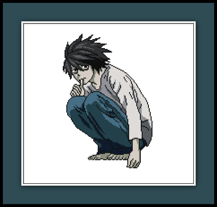
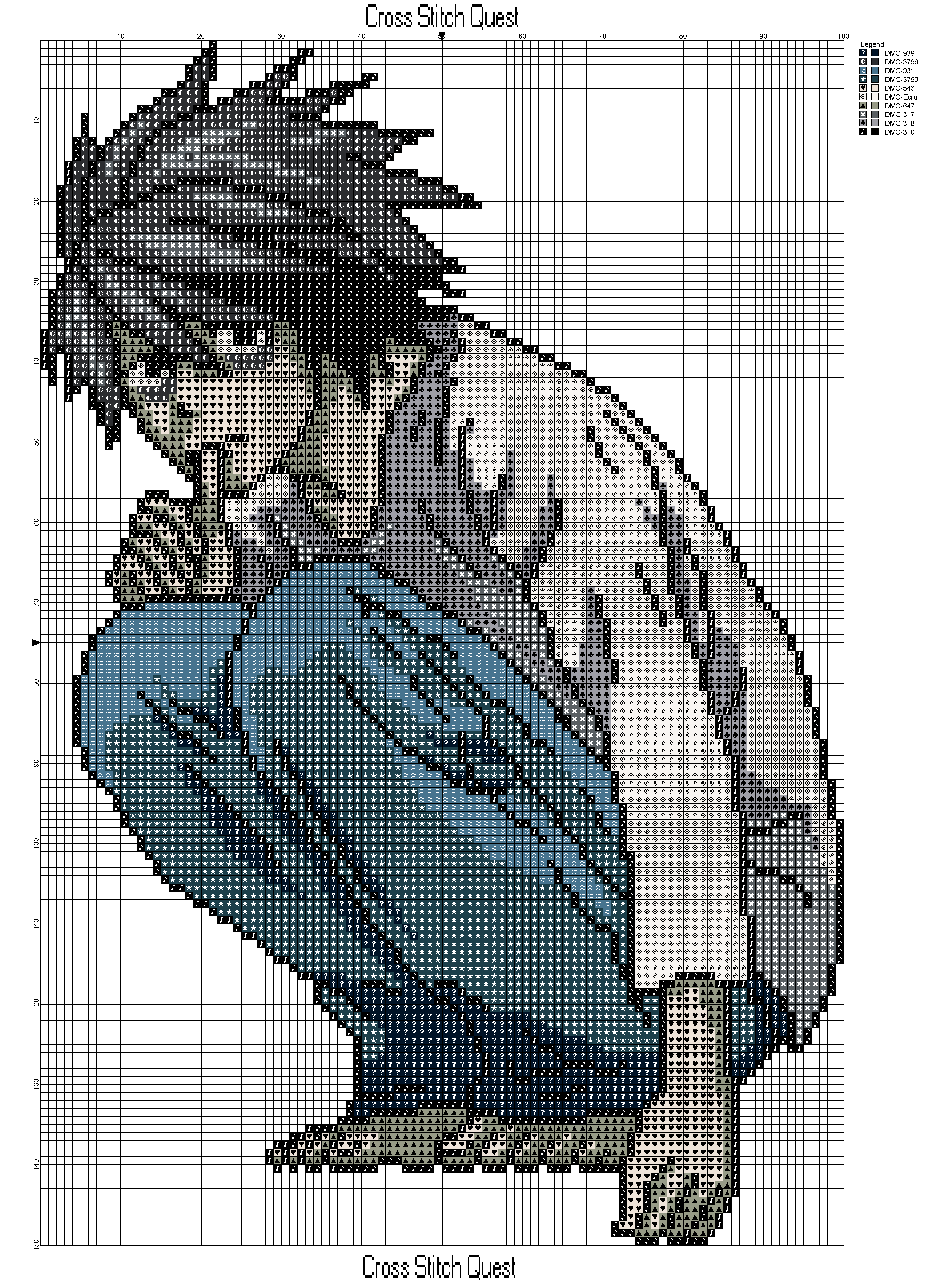
Cross stitch pattern of L from Death Note in his iconic pose. Dowload the PDF here: L Pattern
Grid Size: 100W x 150H
Design Area: 7.14″ x 10.71″ (100 x 150 stitches)
Colors: 10
Help keep the free patterns coming by contributing to my Patreon.
So there’s a new Death Note movie in the works by Netflix and a lot of people have been riffing on the trailer for casting choices. Now it doesn’t bother me a whole lot because the new movie is supposed to be set in Seattle, so changing the races around a bit wouldn’t be strange for the setting, but I am a bit peeved that L looks so… strong? Let me explain. In the original manga, L appears young, weak, sickly, and tired. He’s supposed to appear unnerving but nonthreatening in contrast to how dangerous he really is. In the new Death Note trailer Keith Stanfield has a confident stride and wears a badass masked hood. He looks dangerous and I feel that some of L’s messy childish personality might be lost in the effort to make him look cool for the trailer.
I’m also not big on Light’s new look either. In the manga, Light wears a suit so that he could blend in and appear to be more normal and together than he really is. In the trailer he has this grungy modern look, that I’d actually more expect L to wear. I get that the clothes may be intentional to throw off the audience or maybe so he could fit in better at school (which appears to be a high school now for some reason) but I feel like a cleaner appearance would make for a better contrast to his messed up mind. No, he doesn’t need to wear a full suit, but maybe a tailored suit jacket over a T-shirt or at least something that reflects his upper middle class life.
I just feel like the original costumes played a lot with audience expectations and that some of that depth is now lost because people are wearing clothes that are too revealing of their true intentions.
